Visual Identity
A visual identity (logo) communicates a specific quality about an organization or entity. My designs use typography to visually express the specific quality to be communicated. The animation of the letterforms
The visual identities shown here are for
- IBio. 2015. The IBio (Integrated Biological Sciences) building at WSU. This facility fosters collaborative, interdisciplinary research work. The intersecting arced lines and various sized nodules symbolize the dynamic research connections at IBio. The dot of the “i” in IBio serves as a visual link between the visual elements, being both part of a letterform and part of the network of lines and nodules.
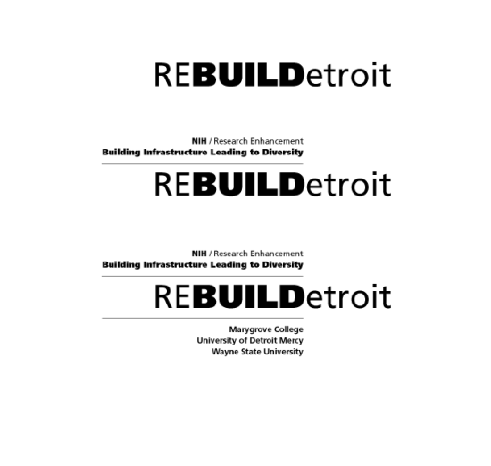
- REBUILDetroit. 2014. WSU received a National Institutes of Health: Building Infrastructure Leading to Diversity Award (BUILD) 5-year grant, “Research Enhancement for Building Infrastructure Leading to Diversity – REBUILD Detroit.” This program provides mentorship and access to research training and opportunities for minority students in biomedical sciences through collaboration between University of Detroit Mercy, Marygrove College, and Wayne State University. The logo captures the programs goal of contributing to the revitalization of Detroit: the uppercase “D” is both the last letter in “REBUILD” and the first letter of “Detroit” and the lighter type weight of the first two and last six letters frame the heavier weight of “BUILD.” The basic logo is shown with variations.
-
D•VERSE. 2014. Detroit Integrated Vision for Environmental Research through Science and Engagement (D•VERSE) is a multidisciplinary research team uses community-based participatory research to develop effective approaches for scientists and communities to work together in addressing urban environmental problems. The variety of type faces symbolizes the diversity of the team and the people with whom it works in Detroit – or “the D” as it is also called.
- WSU BEST. 2013. National Institutes of Health: NIH Director’s Biomedical Research Workforce Innovation Award: Broadening Experiences in Scientific Training (BEST), “Wayne State University – Broadening Experiences in Scientific Training (BEST).” This project provides a training program for biomedical PhD students integrated into their doctoral studies through which they can explore a diversity of career options and gain a wide range of skills that will prepare them for job opportunities in the 21st century, emphasizing the need to work on multi-disciplinary teams. In the logo, the resources of the NIH and WSU frame the BEST program.
- The WSU Yamasaki Legacy Project. 2010. This project highlights the four buildings of the architect Minuro Yamasaki on the WSU campus. The logo symbolizes the experience of seeing the Yamasaki buildings: the play of light and dark on stark white walls against a clear blue sky. In 2011, the logo won an Award of Excellence / Print Media, 41st Annual University and College Designers Association (UCDA).

